
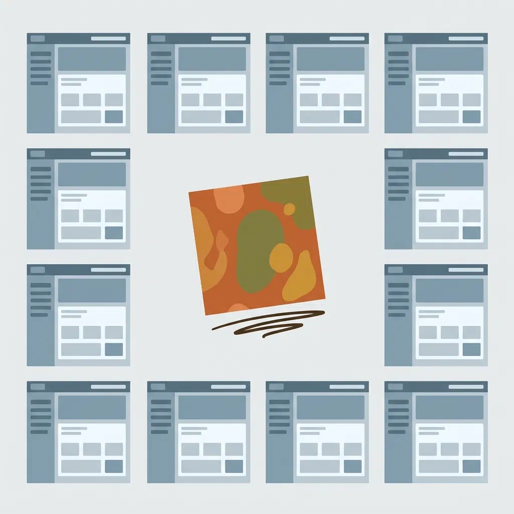
Open ten homepages built this year and eight of them look like they came from the same template. Same gradient, same rounded corners, same friendly-but-forgettable illustration style. That’s what happens when a generation of tools gets trained on the same generation of websites.
The pushback is already here.
Key takeaways
- Hand-drawn illustration, scribble accents and handwriting-style fonts are showing up across brand and web design this year.
- The driver is simple: audiences are getting tired of the smooth, interchangeable look AI-assisted design tends to produce.
- It’s not for every brand. A finance product and a coffee roaster don’t reach for the same amount of imperfection.
What’s actually happening
Designers are leaning back into rough edges: hand-lettered headlines, scribbled underlines, slightly off-grid layouts, illustration that looks like someone actually drew it rather than generated it. Some of it borrows straight from early-2000s web, MySpace-era clutter reworked for a 2026 screen. Some of it is quieter: warm, earthy colour palettes standing in for the high-gloss corporate blue that’s dominated the last decade of SaaS sites.
The common thread isn’t nostalgia for its own sake. It’s a signal. A hand-drawn icon tells a visitor, correctly or not, that a person made this. In a year where AI in web design has become genuinely useful for the mechanical parts of the job but still can’t fake a human hand, that signal has started to matter commercially, not just aesthetically.
Why it’s catching on
Three things are converging at once. AI tools made polished, competent design cheap and fast, which means polish alone stopped being a differentiator. Younger audiences in particular have grown up online enough to spot the AI-flavoured sameness immediately, and they respond better to brands that feel handmade. And there’s a straightforward trust angle: imperfection reads as effort, and effort reads as care.
None of that means sloppy design is suddenly good design. The brands doing this well are being deliberate about where the rough edges go. A scribbled underline on a call-to-action button. A hand-lettered headline on an about page. Not the entire site rebuilt to look like a school notebook.
Who it works for, and who should be careful
This suits brands where warmth and personality carry weight: hospitality, lifestyle, consumer products, anything selling a feeling rather than a spec sheet. It works less well the moment trust-through-authority matters more than trust-through-warmth, healthcare, legal, financial services, anywhere a visitor needs to believe the business is rigorous before they believe it’s likeable.
Even there, the underlying instinct still applies. A finance site doesn’t need scribbles, but it can still ditch the generic stock photography and templated icon set that makes it indistinguishable from the ten competitors sitting next to it in a comparison table.
How to bring it in without it looking gimmicky
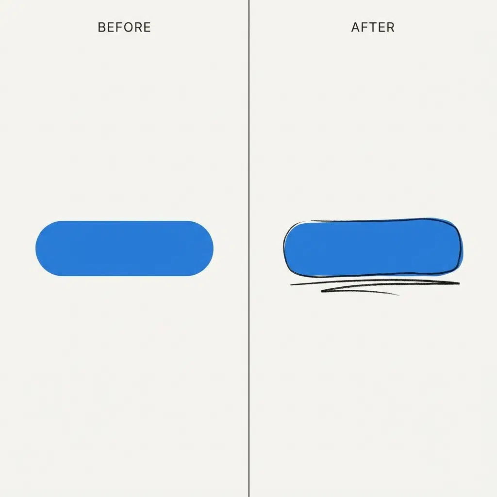
Pick one or two moments on the page, not the whole layout. A hand-lettered headline works. A hand-lettered headline sitting above a hand-lettered subheading sitting above a hand-lettered button label stops working fast; it reads as a costume rather than a choice. Pair the rough element with a genuinely solid grid underneath it. The best examples of this trend are precise about their imprecision: every “imperfect” element is placed exactly on purpose, which is the same instinct we bring to every brand system at FearNaught.
Bottom line
The rougher, more human aesthetic showing up across web design this year isn’t a rejection of good design practice. It’s a reaction to a specific problem: AI made “competent” cheap, so competent stopped being enough. Brands that want to stand out are borrowing the visual language of “a person made this,” carefully, in places where that story actually fits their audience.